Showing posts with label Interior Design. Show all posts

Friday, May 11, 2012

FLOWER POWER ROUND TWO

It has been a feast of flowers around here for the last two months.  My sister's garden is the gift that keeps on giving.  Flowers were clipped on a daily basis filling vases or being delivered to neighbors. We are going to miss all these beauties that are the perfect accessory for every room.


                                                                         Bishop's Flower


                Mix of Sweet Peas, Sweet Sultan, Cornflower Dwarf, Larkspur Giant Imperial


                                                               Godetia Tall Double


                                                               Bishop's Flower


                                                                   Godetia Tall Double


                                              Mix of China Aster, Sweet Sultan, Cosmos,
                                                 Larkspur Giant Imperial, and Godetia Tall Double

Sunday, April 8, 2012

FLOWER POWER


Flowers can change our mood, scent our rooms, punch up our landscape, the list goes on and on. Here are a few that we've scattered around the house from the last few weeks--all freshly clipped from our gardens.


                                                                    HAPPY EASTER!

Saturday, March 31, 2012

ON TARGET


It took some courage to post this photo because of all its flaws.  I am not a professional stylist nor a professional photographer, but I threw caution to the wind and posted it because I wanted to talk to you about my new little find.

My favorite color combination is green and blue.  My bedroom is made up of those two colors and has been for several years.  One day I decided I needed to punch things up a bit.  So, that gorgeous color I call persimmon seemed the perfect choice.  I added a rich cashmere throw to the foot of my bed and it brightened my room.  But I needed another bit of that orangey red peeking out from some little nook so a few weeks ago as I was roaming around Target I spotted this pretty metal tray just the right size and color for my bedroom--see it on the bottom shelf of my nightstand? I love it.  It is just right and not too much money--isn't Target one of life's little joys?

Saturday, September 3, 2011

A PENCIL PLANT TRANSPLANT


We have a crazy, wild pencil cactus plant on our patio.  I took a cue from my friend Robby who took a cutting from her also out of control plant and plopped it into a clear vase filled with water, seashells, and stones.  Easy peasy.   I did the same sans the seashells and love the living, sculptural look sitting on my desk.  Eventually, roots will form and twirl into a sort of nest hovering above the stones.  I'll snap a pic and report back when that happens.


My new arrangement cost me $0 since I already had the plant, the vase, and the stones.  Yea!

P.S. If you live nearby I would be happy to give you a clipping from my crazy patio plant.

P.P.S.  As noted in the comment section (thanks, Bonnie!), when the stem is cut there is a milky white substance that can be an irritant.  I rinsed the stem until the white substance stopped flowing and then washed my hands with soap and water.  I didn't have any problems.

Saturday, April 16, 2011

CHAIR REDUX

I've been slowly refreshing a few tired items in my home.  Two over-stuffed, well-worn chairs from my Mom's house were the recent models for a makeover.  Stashed away in back rooms with sheets tossed over them, it was time for a little update both in fabric and in style.  Tragically, I do not have a "before" picture (don't you just love "before and after" pics?) So, you will have to use your imagination.  


After

Picture this "before": green and peach striped fabric, back cushion beaten down after years of serving as a snuggly spot for a small dog, body of chair very tight, skirt a tad too short.

I wanted a bit of a slipcovered look without the looseness and wrinkles of slipcovers (though I don't mind a bit of wrinkles, do you?)  The new fabric is an unbleached linen-cotton blend. Simple, unadorned.


The "before" chair would have shown arms that were flat in the front with piping, one short pleat on the two front corners,  and more piping around the perimeter of the skirt.  I wanted an updated look so I asked my genius of an upholsterer (Mike Redhorse, love him) to remove the piping around the arms, add pleats on the front of the arms, and add two pleats (one long, one short) on the two front corners of the chair, no piping at the base.  Done.


A softer, higher back was needed (down and feathers) and three pleats on each rounded corner (love those).  Done.


The back of the chair is fitted and then slightly flairs at the pleat, mimicking a slipcover.  I also wanted the skirt slightly longer than the previous chair.


Voila!  Updated, refreshed, and feeling brand-spanking new (with a reduced-priced John Robshaw pillow perched atop).

Tuesday, January 11, 2011

SOFA REFRESH

My sofas (2) needed a freshen-up.  What to do, what to do. New slipcovers? Hmmm, no, more money than I wanted to spend.  And, besides, I'm not totally in love with the sofas. The arms are a bit too high for my current taste.  So, a little refresh was in order.  I peeled off the two back cushions and replaced with this little ensemble of down-filled pillows.  What do you think?


After

I never liked the back cushions of my sofas (see pic below).  They were too stuffed and I was always beating them back into submission.  I even had them refilled but it didn't do the trick for me.


Before
I purchased some fabric at the ill-named Calico Corners during its recent sale (see middle pillow). Had two pillows made filled with 50/50 down and feathers. The other pillows are a combination of pillows I picked up on my recent trip to Belgium and the local Pottery Barn (always good for home accents).

I am so happy with my "new" sofas.  Just a little tweaking and it has changed the look and feel of the room. Hooray for simple changes!

Monday, November 15, 2010

INSPIRATION BOARD

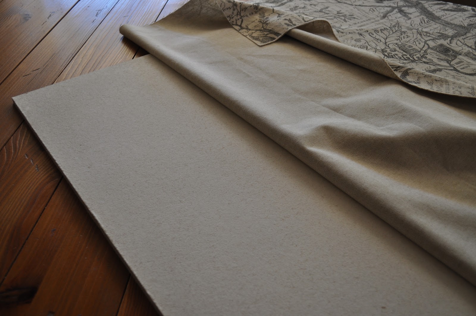
One night while staring at the blank wall in my study, I came upon an idea to fill the space. I knew I wanted a beautiful bulletin board and I wanted it big.  Not two feet by three feet but four feet wide and five feet high.  Anything pre-made would be $$$$$.  So, while staring at the wall I thought about homasote, that 1/2 inch thick tack board that, if covered, would work.  I also remembered that Renee at Mesa Sales had ordered linen fabric covered in French writing. The next morning I went to Home Depot--no homasote.  But was told that white wall board would work even better.  For around $18 I bought an 8 x 6 wall board, cut down to one 5 x 4 and two 2 x 3 pieces. 


Staple gun in hand, I completed the project in less than 30 minutes.  And since my desk is deep, I didn't want it to hang on the wall but to lean, thereby easily accessed. 


Fabric - $18 per yard


This pattern caught my eye and would take care of using more of the board remnants and fill this space in my bathroom nicely. It is also French writing on linen but with an overlaying bird and branch pattern.


I stapled cording onto the back of the board to hang on a pretty little crown hook I bought in Paris last year.

A super simple project done quickly and for $ as opposed to $$$$.  Yea!

Wednesday, March 31, 2010

ARTWORK - Maps

Last Fall while shopping at Juxtaposition, a stylish little shop in Newport Beach, I came across some beautiful wrapping paper. I am a sucker for lovely, thick paper (and ribbon to boot) so seeing large sheets of paper draped over wooden dowels got my attention. To actually feel the paper is a great selling point to me. Don't you hate it when you are wrapping a gift and it tears at the slightest tug?


But this time, instead of a repeating pattern each sheet had a complete scene of drawings such as the natural history of birds, mammals, the Statue of Liberty, fruits, vegetables, and lo and behold of maps. One sheet was $4. A tad too expensive for one-time use wrapping paper but what deal for a piece of art! And since Juxtaposition is a pricey little shop, I was thrilled to find something clearly in my price range.


So, I bought two sheets of wrapping paper of the familiar maps of Paris and London and patiently waited for Michael's 60 percent framing coupon. Normally I take my artwork to Framer's Workshop in Scottsdale where Chris and Rolf work their magic but since wrapping paper isn't exactly an investment I decided to take a less expensive route.


Michael's did a good job, don't you think? You pretty much can't go wrong when choosing neutral matting and a plain, black frame. So now I have two lovely pieces of art in my family room.

Sunday, March 21, 2010

ARCHITECTURAL PRINTS

When I travel I love to pickup artwork whether it be small watercolors by local artists camped out in tourist areas or finding some interesting print in a secondhand bookstore.

The above is what kicked off my love of architectural prints. My sister, Tammy, and I were in a tiny little village, Puddletown (I'm not making this up) in Dorset County, England. We walked in (carefully since the entrance was directly on the main road, no sidewalk, no buffer between the door and the road!) to a miniscule used bookstore and I found this print of an obelisk that sits high upon one of the Cambridge colleges. It was 10 pounds which at the time was around $14. That was 1995.

Since then I have a collected a few more. I found the trio above in London at a junk shop on Portobello Road on my 40th birthday, December 31st. These three beautiful prints were in a french architectural book dated in the late 1700's and cost 20 pounds each--around $30 at the time.

I found this old print last summer in New York for $15. Isn't it pretty? I was touring the Kips Bay Designer Show House and this was in the gift shop, ripped out of a book from the 1800's.


Digging around in a shop in Rome I came across this water-stained print and loved the lines despite the brown, crinkly paper. It was also super cheap, just can't remember anymore. But I do remember the shop owner arguing with her husband in rapid-fire Italian.


And these three were found on separate trips. The top is of a fountain on a bridge over the Tiber River in Rome. The second, I found for $5 in York, it is an intricate drawing of a gate. And the last I found in Oxford--a drawing of a ceiling. Wouldn't you love to be looking up at that ceiling?


Some of these prints are fragile and don't travel well so I now carry a mailing tube with me which protects the art.


All of these pieces are some of the reasons I love traveling. To walk in to some tiny little dusty store, dig around in boxes and come up with a little gem while chatting with the shop owner enriches my experience. And to bring it home to display visually reminds me of a great trip.

Saturday, October 10, 2009

WHY I LOVE THE LIBRARY

There have been a few interior design books I've had my eye on for quite a while. But even with a 40% discount from Border's or Amazon I haven't wanted to spend the money. But lo and behold they've been parked at my local library this whole time!

What a treat to pick up these books and take them home to peruse at my leisure. Kathryn M. Ireland (the Brit, not the former model), Bunny Williams, and Charlotte Moss are some of my favorite interior designers. It's always interesting to me to see just what they do to make a room comfortable and stylish. Some of what they do is waaay too over the top for me and over done. But I can usually learn something from each of the rooms depicted. Maybe it will be a color combination I hadn't thought of or using an item a different way than it was intended.

Interior design books and magazines help me to think a little differently about design--and I'm a great copycat. For instance, I needed something to hold the piles of mail received at home, not just stacked on the counter. So I found a deep lid from a square basket and now I have something good looking to hold the mail.


Then I took a pottery bowl that I seldom use and put it to use holding all of my half-empty seed packets. Functional and good looking. These are minor changes but they perk things up a bit around the house.

I know I've gone off a bit about interior design when the real purpose of this post is to say, "Yea for libraries!". New technology has made it so easy to check-out a book. A click to find out if the library has the book, then a click to put it on hold, another click to have it delivered to the branch nearest you. Then an email is sent stating "your book is ready for pick-up". You can even renew on-line. It couldn't be easier. So, three cheers for libraries! Use them.

Thursday, September 3, 2009

BEFORE AND AFTER

Don't you love before and after photos? I do and I have a few to share with you.

This past July my favorite stationery shop, M & Co. Papery, closed its doors. The darling and talented Marlene Dunn had been the proprietress of one of the few bright spots in downtown Mesa for ten years.

I stopped by a few times during the month of July picking-up discounted items including stationery, a chair for my library, and this beauty (see below). I badly needed lateral filing space and more shelves for books for my home office. And then one day I walked in to her shop (again) and saw this in the back. This is what Marlene used for her daily office needs. I bought it immediately.

I knew I wanted to lighten it up for my home so I called Martha Forzano of Forzano and Son she sent her guys to pick it up and together we figured out the perfect sage green glaze.


This is one of those great moments when what I envisioned is exactly what I got. I love this piece! Martha even had one more shelf made for me and you can't tell the difference between the original and the extra piece. It is a lovely solid and functional piece. It even has lights inside the top of the bookcase and they all work. And I love that this was well-used for a worthwhile business.

The books aren't yet artfully arranged but all of these books (and a few more) have been in piles scattered around the house. It is nice to see them in some order.

So then as I was waiting to talk to Martha (who has the best design sense) I spied this little table stacked up on two other tables. I immediately loved it and bought it. Martha had designed it herself and lucky me, it hadn't sold yet.


Picturing this in my family room, I opted for a black glaze with a little rubbing. Martha agreed and once more I was thrilled with the result.

Below is the table placed and ready for action. The pics on the table are of my cute Mom and the smaller picture is my Dad eating an ice cream cone walking along the Rhine River.

The next before and after story is about my front door. It badly needed a freshen up and although I have a design idea for a new door it will have to wait. Isn't paint a great invention?


I love this color (Bon Nuit by Frazee in Low Sheen).


This color works great both inside and outside. Believe me, I wasn't up to the challenge of selecting two different colors.


It looks great, doesn't it?


The next project for the front entrance is to replace the glass block with some type of beveled glass. But for now, I'm happy.